
See where users actually click. How to use heatmaps to find friction, validate design decisions, and improve the product experience with real behavior.
When designing products, we tend to make an assumption about how users will interact with every screen: First, they’ll scan it. Then, they’ll consider every available functionality. And finally, based on that analysis, they’ll select the best option. This seems reasonable enough.In reality, however, users tend to just pick the first reasonable option they come across (a psychological process known as satisficing) and use the product accordingly. (We're arguably the most intelligent of species, but like many animals, we're also notoriously lazy and attracted to shiny things.)[caption id="attachment_2004063" align="alignleft" width="300"]

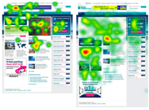
"Hm, Nasdaq down 1,000 again..."[/caption]Heatmaps help visualize data — they might, for example, outline the weather forecast or show various government statistical data.Online, heatmaps help track user activity on a page. With a heatmap tool, you can monitor a user’s cursor activity to observe:
Such information can help you discover your users’ preferences, behavior patterns, and how they interact with product features. They can help you determine whether users find your interface simple enough to use and offer insight into which elements they might encounter or prioritize on each screen.The list of ways product managers and UX designers can take advantage of heatmaps is extensive. To get you started, here are a handful of ways to use heatmaps to determine where your product is hot (and where it's not):
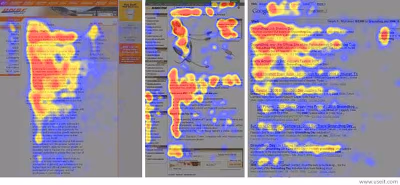
The way a user scans a screen — their “scanning pattern” — can provide valuable insight into your users’ behavior patterns.In general, people follow an F-shaped pattern when scanning a page:
As Jakob Nielsen reported when observing our online behavior:
But as it turns out, scanning patterns can change depending on the way information is presented:The Gutenberg Diagram

This pattern is activated when users are presented with a content-heavy screen.(source)Some users begin scanning the page on the upper left of the screen; this area ultimately receives the most attention. Next, they move down across the quadrants to the bottom right section, the second area of focus.The Z-Pattern Layout
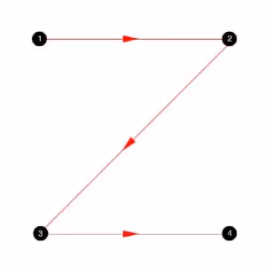
This pattern is activated if the user has to absorb a lot of important elements presented in a graphical way. As the name suggests, these users scan the page following the outline of character “Z”.Knowing how users scan each screen can help you strategically place the most important information and functionality along their visual path, increasing the likelihood that they’ll spot it.
As research conducted at the University of Barcelona reveals, “Human visual attention first responds to contrast in color and light.”When viewing a screen, users tend to first interact with elements that stand out visually – images, graphics, and other elements that stand in contrast to the page.This particular trait becomes problematic when less significant page elements seize an undue amount of user attention. It’s important to make sure that you’re using contrasts in color, light, and design to your advantage, not to your detriment.

“Fold” has become one of the most prevailing myths in UX.In 2010, Jakob Nielsen reported, “Web users spend 80% of their time looking at information above the page fold. Although users do scroll, they allocate only 20% of their attention below the fold.”However, many studies have since undermined this theory, proving that content below the fold often outperforms content at the top..For instance, according to a research by Clicktale, the length of the page has no influence over whether or not a person chooses to scroll:

CXPartners’ tests revealed that when faced with little content above the fold, users are likely to scroll down to find other information:
And when researching how online advertising engages users, Chartbeat discovered that 65.7% of the total engagement happens below the fold.But does it mean that your users are going to notice and access functionality placed at the bottom of the screen?The only way to find out is by observing their behavior. Many Heatmap applications allow also to monitor scroll behavior, allowing you to assess how deep into the screen users are willing to scroll, where they typically drop off, and what information attracts them the most.
Microcopy – form field labels, button language, comments, and prompts all affect the user experience.These elements assist users when they interact with the app, and provide guidance in completing tasks.But if not done right, they could frustrate users, causing them to abandon specific functionalities or even the product altogether.In one such scenario, Baymard discovered that shoppers were less likely to complete a purchase when asked to submit seemingly unnecessary information at checkout without reason.They found that adding a simple explanation about why a store needed the information was enough to overcome many customers’ security and privacy concerns.Your app users think in similar terms. They get agitated if you provide them with confusing directions or ask them to provide seemingly unnecessary information.As with product features, it’s necessary to use heatmaps to observe how your customers respond to your microcopy and make sure they’re helped, and not hurt, by it.
Observing the way users interface with your product is key to developing a great product. A heatmap helps you assess which of your UX elements help customers get the most of your product and which obstruct the user experience. Now that's hot.
Turn scattered user data into meaningful customer intelligence, guiding smarter decisions and creating a better product.
Talk to an Expert