Your counterparts in the marketing department already know that Google Analytics is an incredibly valuable tool for measuring

Your counterparts in the marketing department already know that Google Analytics is an incredibly valuable tool for measuring and optimizing a host of things such as lead generation, sales, and customer engagement. But this tool can be just as valuable for a data-loving product manager who’s always on the lookout for more insights to drive decisions and assist with activities like product roadmap prioritization.I should note here that Google Analytics isn’t just for purely web-based solutions. If you’re building a mobile app you can use their Mobile App Analytics to get mobile-specific data to drive your decision making, such as which screen dimensions and OS versions to focus on. If you’re building a desktop app, Google Analytics is a little trickier to use and requires leveraging the Measurement Protocol, but it may be a good solution if you’re budget conscious and your development team is up for the challenge.
Before you start piggybacking on the marketing dashboard, a quick piece of advice: use separate tracking IDs, “Marketing pages are meant to convert leads. Applications are meant to solve user problems. These are two totally different purposes and if we try to track them under the same Google Analytics tracking id we’re going to create a real mess for ourselves. So, our first suggestion is to use a different tracking id for your application than you do for your marketing site. This way, you won’t be competing with your marketing folks over things like custom variables, dimensions and metrics,” advises Pollen.io in a piece about using GA data to optimize SaaS applications.
Once you’ve set up GA with separate tracking IDs, here’s 7 great ways to leverage Google Analytics to make product decisions:
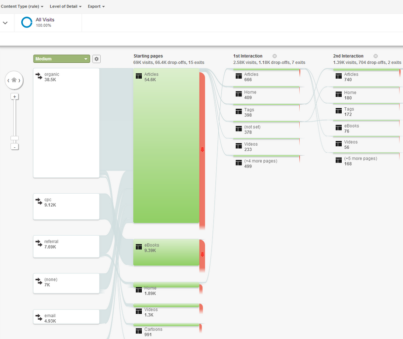
Did you ever wish you could look over a user’s shoulder and follow along as they use your product? Of course you do, and you’ve probably conducted plenty of usability tests where you did just that, but what if you could look over EVERY user’s shoulder? Google Analytics Behavior Flow report let you do just that.[caption id="" align="aligncenter" width="692"]

Source: Google Analytics Blog[/caption]This report is available at Behavior > Behavior Flow and shows you exactly how many users are flowing from one page to the next to the next in a highly visual manner. It’s best suited for spotting key trends, such as “half the users go from Page A to Page B” and “almost everyone visiting Page X is coming from Page Z.”“For example, if you see significant drop off on a certain level of your game, you may want to make that level easier, so that more users complete the level and progress through the game,” says Russell Ketchum, Lead Product Manager, Google Analytics for Mobile Apps. “Similarly, if you find users who complete a tutorial stay engaged with your app, you might put the tutorial front and center for first-time users.” (Source.)This report lets you see if users’ actual paths of behavior are what you had in mind when you designed the site. If your site architecture is really complex or you have a lot of pages that do the same sort of thing, the default view may be too overwhelming to digest; in that case you can use content grouping.“Content Groupings let you group pages and content into a logical structure that reflects how you think about your site,” says Matthew Anderson of the Google Analytics Team. “The more time you spend setting up your Content Groupings, the more information you will be able to discover from viewing them in the Behavior Flow."
Additionally, if your site has a lot of pages you can use the sliders feature to zoom in on particular steps to see even more detail.
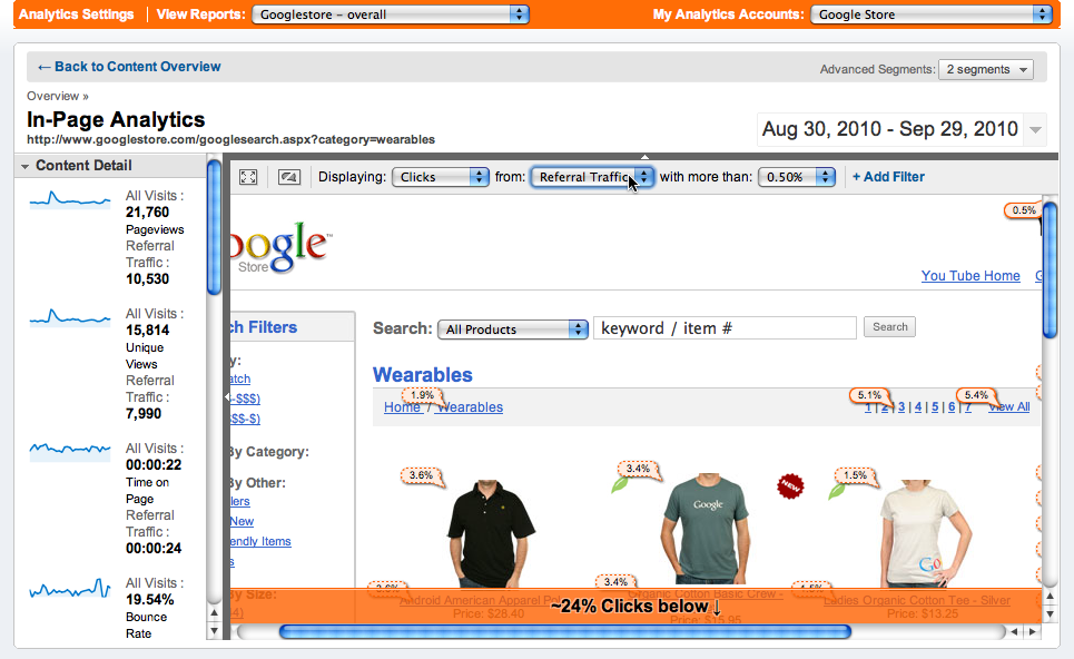
Most pages have more than one link for users to choose from, and sometimes the page design might feature multiple instances of the same link in different places (such as a top navigation bar, a call-to-action link at the end of some text and a clickable image).[caption id="" align="aligncenter" width="692"]

Source: Google Analytics Blog[/caption]“Imagine that you are looking at one of your product category pages, wherein both a picture of the product and the product’s name are linked to the same product detail page. In this example, the product name, which is probably a simple link, and the image would have the identical click percentage,” says Armando Roggio of Practical Ecommerce, “Put another way, you would know what percentage of the clicks on the page lead to the target page, but you would not know if the image was generating more clicks than the link or vice versa.”Google Analytics’ In Page Reports let you see exactly where users are clicking, and not just what the end result was (i.e. going from Page A to Page B). However, this feature only works if you are using Enhanced Link Attribution. Once that’s in place, you will be able to see exactly what and where users are clicking.
But it is important to note that this report is not accessed in the same way as most Google Analytics reports. Instead, you use Google’s Page Analytics Chrome Extension and then go to the actual page on your site to see how often each link is being clicked.
Depending on your organization, there's a small chance you may still be fighting internally with folks that are positive people aren’t using their mobile devices to access your site. You can now use data to win this argument with Audience > Mobile > Overview. You will instantly be able to tell detractors how many visitors are coming to your site on their tablet and on their smartphone.
Beyond that, you can use a secondary dimension to see what devices mobile users are visiting on and whether mobile users are visiting specific parts of the site, getting stuck in different places, or completing specific tasks (goals). This can help you prioritize which areas of your site need the most mobile attention during the design and testing phases.
You no longer have to guess which features your users prefer using, Google Analytics gives you the data that shows exactly which are more popular than others. Assuming you have a distinct page (or pages) for each feature, you can visit Behavior > Site Content > All Pages section and see by percentage which pages are getting the most visits (and therefore which features are being used most often).
It’s pretty straightforward, but you can also use this feature to track how feature usage is trending over time. Did adding new functionality change the ratios? Did adding a new feature drastically reduce usage of another so you can justify reallocating resources.If your site is more complicated, you can use content grouping to bundle together the relevant pages for each feature, providing a quick view in a custom report for this kind of data.
When - or more precisely, where - your users are bailing on your site is extremely useful information, since it indicates points of frustration or closure for your users. Google Analytics Exit Reports can provide you with this data at Behavior > Site Content > Exit Pages.
This report can tell you a few things:
While Exit Reports are useful, it’s also important to remember that everyone must exit your site at some point. “Top exit page analysis is a good way to highlight areas that may need focus but it is important to understand that there are more factors to site exit than just poor usability or communication,” says James Cornwall, Digital Analytics Manager for Shell. “When using the Exit Report it’s vital to note what roles each page may be playing.” (Source.)
As a product manager, you are often challenged by engineers, management and yourself to “prove” that a new way of doing things is better than the status quo. There’s no better response than to run an A/B test so you have data to back-up or disprove your theory. Google Analytics makes this really easy and, most importantly, doesn’t screw up what is already working.Once you know what you want to test you need to set up a page for each hypothesis. Let’s say that you think a blue button is better than the red one that you’re currently using on the site. You clone the page with the red button, swap in the blue button on the new page and then select Behavior > Experiments > Create Experiment. You give it a name, you set a goal (i.e. more button clicks) and then you can generate the required code snippet. That snippet gets placed on the original page (the “red button page” in this test) and then you are up and running. Some traffic will get diverted to the blue button page while others will continue visiting the original.After a few weeks you will have enough data to show which button works best (or if there’s no difference between them). You can also test as many variants as you’d like at the same time, so if there’s also someone lobbying for a purple or green button, you can test ‘em all at once.“As time goes on and hypotheses start showing promise Google will send more visitors to the leaders. It has two big advantages over a traditional A/B test that distributes traffic evenly until completion. First, by sending more traffic to winning variations while the experiment is running, you start to benefit from the leaders earlier. Fewer visitors are sent to poor performers before the experiment end,” says Kris Jordan, Partner at New Media Campaigns. “A side effect of this is the other key benefit: deciding the best of multiple good choices happens more quickly.” (Source.)
Not all users and sessions are created equal, and Google Analytics lets you slice and dice to your heart’s content. With every report you have the opportunity to segment the results by a variety of parameters, such as date ranges, geography, browser types, age and affinity categories.For example, you might want to only look at users that started using the product since your last release or users that got started during a free trial campaign. You can also create and save these custom segments so you can easily check back in to see how female users from Florida are doing whenever you feel like it.
As with all data, it’s not just what you have, but what you do with it. It might be tempting to try and track and analyze every spec of data that a powerful and broad tool like Google Analytics can offer.Remember, it is a tool and not your boss, so you should only be engaging with the data when you are trying to answer questions (i.e. what changed over time or how are different people using my product). As Victor Chan, a digital strategist at Magnify Digital put it in a post about using Google Analytics to make business decisions:
Turn scattered user data into meaningful customer intelligence, guiding smarter decisions and creating a better product.
Talk to an Expert